
Patient psychology in intake flows: 10 principles for completion
Ten principles from behavioral research applied to online health intake: disclosure, privacy, effort, progress, choice, kind endings and price timing.
Written for growth and product leads at telehealth and DTC health brands who own an intake flow
People finish an online health intake when each screen feels safe, short and worth answering. Much of the drop-off comes from how questions feel to answer: embarrassment, worry about who sees the answers, a flow that seems endless, or a surprise at the end. Below are ten principles for those moments, what each looks like in an intake step, and a do and don’t for each.
What is patient psychology in an intake flow?
It is the feelings and mental shortcuts a person brings to a health questionnaire, and how each step works with them or against them. A patient filling in a weight loss, hormone or mental health intake is often alone, on a phone, answering questions they may never have said out loud. They decide, screen by screen, whether to keep going.
The research cited below comes from settings like coffee cards, jam tastings and surveys, not health intake, so treat it as hypotheses to test, not guarantees. Your clinicians decide who is eligible and what is asked. This guide is about how the questions are presented.
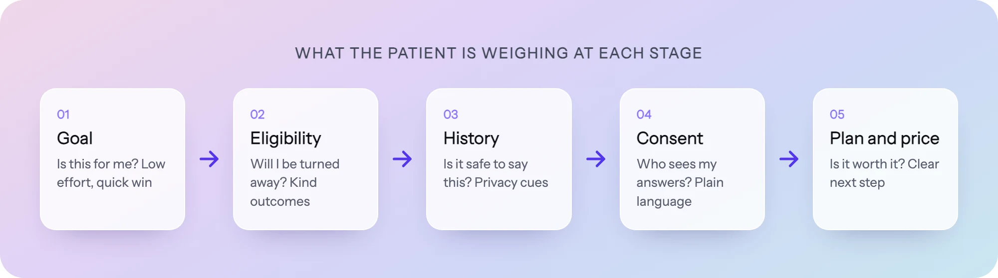 What a patient is weighing as they move through an intake flow.
The 10 principles
1. Lower the cost of an embarrassing answer
What it is. People edit what they report on sensitive topics to avoid embarrassment. A review of survey research by Tourangeau and Yan (Psychological Bulletin, 2007) found misreporting on sensitive topics is common and depends on design features of the survey, including whether an interviewer is present.
In the flow. Questions about weight, sexual function, alcohol use, mood or past diagnoses, where the clinician depends on an honest answer.
- Do: “Many people we see have tried other medications first. Have you taken any of these?” Neutral answer options, including “Prefer to discuss with my clinician” where your clinicians allow it.
- Don’t: “Do you admit to drinking more than…” or answer options that sound like a judgment (“Excessive”, “Problematic”).
2. Say where the answers go
What it is. Health data feels different from a shipping address, and the worry is not imagined: in 2023 the FTC acted against BetterHelp for sharing health questionnaire answers with advertisers. A privacy worry left unanswered becomes a reason to close the tab.
In the flow. A short line under sensitive questions that says who reads the answer and why it is asked. It has to be true. If your ad tools could receive health answers, fix that first (our HIPAA intake playbook covers how).
- Do: “Only your care team sees this. We ask because some medications are not safe with this condition.”
- Don’t: A generic padlock icon and “Your data is secure” in the footer, with no word on who sees it.
3. Make the effort feel smaller than it is
What it is. People judge effort before they spend it. A long scrolling form signals work; the same questions on short screens feel lighter.
In the flow. One question, or one tight group, per screen. Cut every field that has no clinical or operational reason. Give an honest time estimate at the start.
- Do: “About 5 minutes. You can stop and come back.” Then ask only what a clinician needs to decide.
- Don’t: Forty fields on one page, or “Takes 2 minutes” on a flow that takes ten.
4. Show progress, and front-load the fast steps
What it is. The goal-gradient effect: people speed up as they get closer to a goal. Kivetz, Urminsky and Zheng (Journal of Marketing Research, 2006) found café customers bought coffee more often as they neared a free one, and that a 12-stamp card with 2 stamps already filled was completed faster than a plain 10-stamp card, even though both needed 10 purchases.
Progress bars are not automatically helpful, though. A meta-analysis of web survey experiments by Villar, Callegaro and Yang (Social Science Computer Review, 2013) found a constant-speed progress indicator did not significantly reduce drop-off overall. Indicators that moved fast early and slow later reduced drop-off; ones that moved slow early increased it.
In the flow. Put quick, easy questions early so the bar moves. Never show a bar that crawls through a long medical history.
- Do: A thin progress bar that moves visibly on the first few taps, or named sections (“Your goals, Your health, Your plan”).
- Don’t: “Step 3 of 41.” A large denominator makes the end feel far away.
5. Start with a small, easy yes
What it is. Commitment and consistency. In Freedman and Fraser’s foot-in-the-door studies (Journal of Personality and Social Psychology, 1966), people who first agreed to a small request were more likely to agree to a larger one later. A later review by Burger (Personality and Social Psychology Review, 1999) found the effect is real but depends on conditions, and sometimes does not appear at all.
In the flow. Open with a question that is easy, relevant and about the person’s goal, not their medical history or contact details.
- Do: “What would you most like help with?” with three or four clear options, then the harder questions.
- Don’t: Open with email, phone and date of birth before the person has seen anything about their own situation.
6. Offer fewer, clearer choices
What it is. Choice overload. Iyengar and Lepper (Journal of Personality and Social Psychology, 2000) found people were more likely to buy jam or chocolate, or write an optional essay, when given 6 options rather than 24 or 30. But a meta-analysis by Scheibehenne, Greifeneder and Todd (Journal of Consumer Research, 2010) found the average effect across studies was close to zero, with large variation. The fair reading: more options can hurt, but not reliably, so trim them where they are hard to compare.
In the flow. Plan, dose or product pickers, and long lists of symptoms or conditions.
- Do: Recommend one plan based on the answers, with one alternative. Group long condition lists into a few categories, with “None of these” always visible.
- Don’t: Eight plans side by side with fine-print differences, or a 60-item checkbox list with no search or grouping.
7. Put trust signals at the moment of disclosure
What it is. Reassurance works best where the worry happens. A landing page badge is forgotten by the time someone is asked to upload a photo of their skin.
In the flow. The step just before or during a sensitive disclosure: medical history, photo upload, ID check, consent.
- Do: On the photo upload step: “Your photo is reviewed only by your licensed provider and is stored with your medical record.” Accurate, specific, next to the button.
- Don’t: Logos of press mentions on the photo step, or claims you cannot back up, such as “HIPAA certified” (no such certification exists).
8. Write a kind “not a match” ending
What it is. Framing. Tversky and Kahneman (Science, 1981) showed that how an outcome is described changes how people respond to it, even when the facts are the same. An ineligible result can read as a rejection or as useful guidance.
In the flow. The ending for people your clinicians’ criteria screen out.
- Do: “Based on your answers, this treatment is not the right fit right now. Here is why, and here is what may help instead.” Offer a waitlist, another program, or a suggestion to talk with their own doctor, as your clinical team decides.
- Don’t: “You do not qualify.” with no reason and a button back to the homepage.
9. Reassure them a clinician reviews it
What it is. People value work they can see. In experiments simulating online travel and dating services, Buell and Norton (Management Science, 2011) found that showing the work being done raised how much people valued the service. In telehealth, that work is a clinician reading the answers.
In the flow. The review screen, the submit button and the confirmation page. Explain what happens next and roughly when.
- Do: “A licensed clinician will review your answers. If anything needs clarifying, they will message you before deciding.” Show a short summary of answers the person can edit before submitting.
- Don’t: “Approved!” seconds after submit, or a confirmation page with no next step.
10. Reveal price before it feels like a trap
What it is. Surprise at checkout feels like a bait and switch. Someone who spends ten minutes on personal health questions and then meets a price they never expected has a reason to leave and to distrust the brand.
In the flow. Pricing should be findable before the intake starts, then shown in full once the person knows which plan fits them, before any card details are asked for.
- Do: “Plans from $X a month, shown after your answers” on the first screen, then a clear breakdown (medication, consult, shipping, renewal terms) on the plan step.
- Don’t: Hide the price until the payment form, or show a first-month price without the ongoing one.
The 10 principles at a glance
| Principle | In the flow | Example |
|---|---|---|
| Lower the cost of embarrassing answers | Sensitive history questions | Neutral wording, no judgment in options |
| Say where answers go | Under sensitive questions | ”Only your care team sees this” |
| Make effort feel smaller | Whole flow structure | One question per screen, honest time estimate |
| Show progress, fast steps first | Progress bar, step order | Easy goal questions first, sections not “3 of 41” |
| Start with a small yes | First screen | ”What would you like help with?” |
| Fewer, clearer choices | Plan pickers, condition lists | One recommended plan plus one alternative |
| Trust at the moment of disclosure | Photo, ID, history, consent steps | Who sees the photo, next to the upload button |
| Kind “not a match” ending | Ineligible endings | Reason plus waitlist or another path |
| Clinician review reassurance | Review and confirmation screens | ”A licensed clinician will review your answers” |
| Price before it feels like a trap | First screen and plan step | ”Plans from $X”, full breakdown before card |
For how large telehealth brands apply some of these in practice, see our teardown of how Hims, Ro and Hers build intake flows.
Putting it into practice in PathwAI
PathwAI is an AI-native builder for patient intake flows, eligibility quizzes and checkout funnels. Each principle maps to something you can change without an engineer:
- One question per step, in any order. The visual builder puts eligibility, intake, consent and checkout steps on one canvas, so splitting a long page or moving the goal question to the front takes minutes, not a ticket.
- Kind endings through routing. Routing rules branch on any answer or combination of answers. People who do not meet your clinicians’ criteria get a custom message, a waitlist or another treatment path (see the eligibility quiz use case).
- Consent where it is read. Consent is its own step, timestamped and stored with the intake data.
- A privacy line you can stand behind. The Data Platform sends conversions server-side, strips PHI such as condition and date of birth before any event leaves, and gives ad platforms only hashed identifiers, only for visitors who consented. That makes “only your care team sees this” an honest sentence.
- Test a change instead of guessing. Step-level analytics and A/B testing show completion and drop-off for every screen. Change one thing on the step where people leave (wording, order, where the price appears) and test it against the current version.
- Start from a template. The templates include a GLP-1 eligibility and intake flow you can adapt, with your clinical team reviewing every question and rule.
Checklist
- The first screen asks about the person’s goal, not their contact details.
- Each step has one question or one tight group, and every field has a reason.
- Progress moves visibly in the first few steps.
- Sensitive questions use neutral wording and say who sees the answer.
- Trust copy sits on the photo, ID, history and consent steps, and every claim is true.
- Plan choices are few, with one recommended.
- Every ineligible ending gives a reason and a next step your clinicians approved.
- The review screen says a clinician reads the answers, and what happens next.
- The price model is visible before intake, and the full price before card details.
- You can see drop-off per step, and you test one change at a time.
Frequently asked questions
Do these principles guarantee a higher completion rate?
No. The research comes from settings like coffee cards, jam displays and surveys, and some effects (choice overload, foot-in-the-door) vary a lot between studies. Use them to decide what to test, then measure completion per step in your own flow.
What should an ineligible patient see?
A clear, kind reason, and a next step your clinicians approve: a waitlist, another program, or a suggestion to speak with their own doctor. Eligibility rules and that wording should come from your clinical team.
Can we ask sensitive questions early to screen people out faster?
Hard eligibility questions do belong early, so people do not fill in a long history before learning they are not a fit. Open with one easy goal question first, then the screening questions, each with a line explaining why it is asked.